Introduction #
This document provides an introduction to creating Line Graphs in OnPing, including naming, updating, adding parameters, changing the max step, time travel mode, linking graphs, and presentation mode. It also explains how to stack graphs side by side, horizontally and vertically for user customization.
What is a Line Graph? #
A line graph is a type of graph that is used to display the relationship between two variables. It is composed of data points connected by straight lines, and is typically used to show changes of a value over time.
Using Line Graphs #
Using line graphs is beneficial because it provides an easy way to visually analyze data and identify trends or anomalies. Line graphs provide a clear and concise way to compare different data points and identify patterns, which can be used to make informed decisions about a system’s performance.
Additionally, line graphs can be used to track the performance of different systems over time, allowing users to see how a system is progressing and make adjustments if necessary.
By combining OnPing’s monitoring solution with line graphs, users will gain a better understanding of a system’s performance overall.
Creating a Line Graph in OnPing #
Creating a Line Graph in OnPing requires selecting a panel within the Dashboard to display the graph, adding a Widget to the Dashboard, adding a functionality such as Line Graphs, selecting parameters to ‘Y-Axis’, changing the Time Period.
Additional parameters can be applied to the ‘Y-Axis’ by using the search field, and adjust the graph’s max step and update settings. ‘Time Travel’ mode can be enabled as well as the ability to adjust the destination time and time period to view the trend over a varying time period.
Step 1: Create a Panel
Start by clicking on the gray button on the top right toolbar of the dashboard labeled ‘edit dashboard mode’.
In ‘edit dashboard mode’ navigate to the panels on the dashboard and click the ‘+ Add Panel’ to create a new panel for the Line Graph to exist on.
In this example, the new panel that was created is labeled ‘Line Graph Example’
Step 2: Create a Line Graph Widget
On the new panel created in Step 1, click the blue ‘+Widget’ button at the top right corner of the window.
This will open the available widgets to assign to the new panel. Scroll down to the ‘Graphs’ category and select ‘Line Graph’ by clicking the blue ‘Add’ button next to Line Graph option.
This will create a ‘work area’ widget for the new Line Graph.
Navigate to the top right toolbar and click the blue ‘Save’ button to save the widget.
A notification in OnPing will display in the bottom right corner confirming the dashboard has been saved (with the new widget). The ‘work area’ setup for the line graph is complete.
Step 3: Name the Line Graph Chart
Wrench Icon
To customize the New Chart, click the Wrench Icon at the top right toolbar of the Line Graph widget window.
This allows the user to further customize the New Chart. Navigate over to the left side of the window and replace the title ‘Line Graph’ with something applicable.
In this example, the line graph will be labeled ‘Plunger Times’.
Navigate to the Title text bar and replace the title New Chart with something applicable.
In this example, the Title for the chart will be labeled ‘Plunger Times’.
Save Graph
Navigate to the green ‘Save Graph’ button on the right side of the window to save the new graph label and title. Perform saves frequently.
A notification in OnPing will appear in the bottom right corner displaying that the save was successful.
Step 4: Configure Chart Settings (Part 1)
After saving the chart, configure the chart settings by adjusting them appropriate to the application.
Refresh Graph
When the graph is generated, the ‘Refresh Graph’ button will be used to display the graph with updated information.
Import / Export Graph
The ability to import or export graphs is available.
Update Time
Update time is the amount of time it takes for a system or device to update information. It is used to measure the speed at which a system can gather and process data. Update time can also mean ‘the amount of time it takes’ for a system to display new information.
In this example, the ‘Update’ time will remain 60 seconds. An option to update the data in real-time can be selected in the dropdown menu under ‘Update’ time.
Step 5: Add Parameters to the Chart
Scroll down to the bottom of the ‘Y1’ window and click the blue ‘Add parameter’ button to add some data to the line graph.
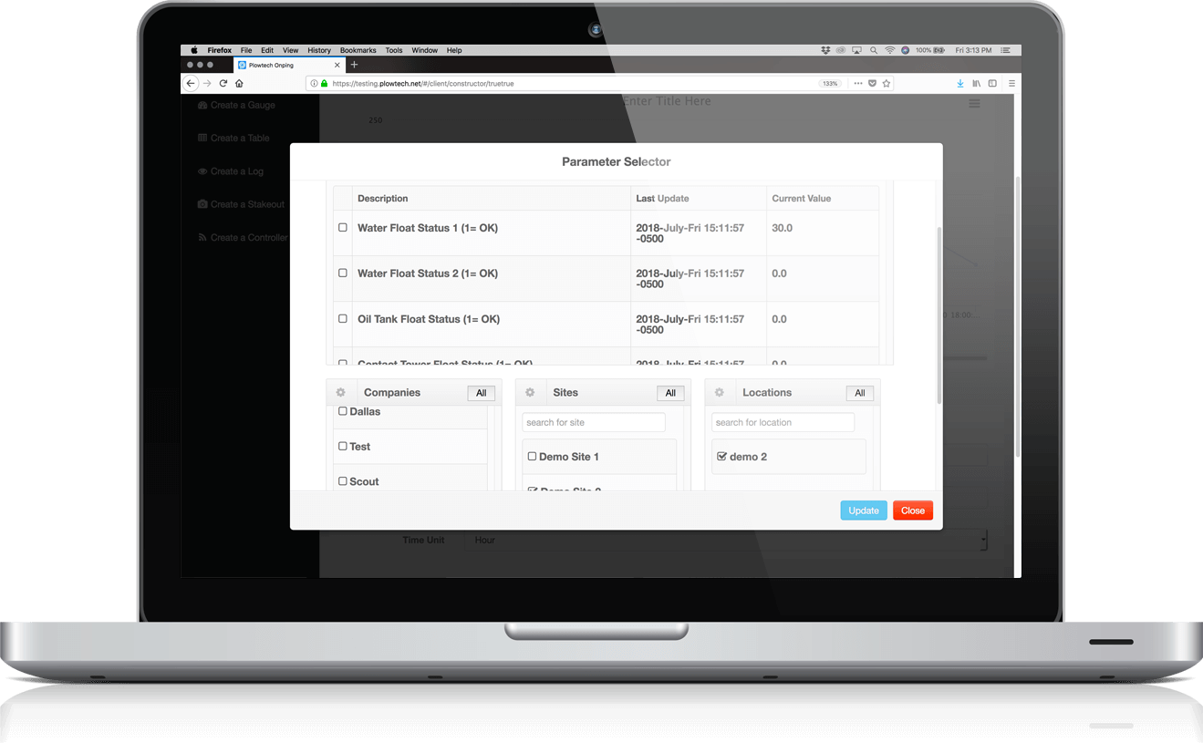
Selecting Company, Site, and Location
Select the Company for where the target parameter exists. In this example the company is called ‘Plow Demo’. Click the checkbox next to the company name to display the list of available sites to choose from.
Select the Site for where the target parameter exists. In this example ‘Plunger Lift Tuning Demo’ is selected. Click the checkbox next to the Site to display a list of available Locations to choose the parameter from.
The only location that is available ‘Plunger Lift Remote PIDs’ is selected. Click the checkbox next to the Location to display a list of device parameters.
PID control (Proportional-Integral-Derivative)
is a type of control system used to regulate a process or system by using a combination of proportional, integral, and derivative controllers. PID controllers are used in conjunction with PLC systems (Programmable-Logic-Controllers) to ensure that the entire system is operating correctly and efficiently.
P – The proportional controller adjusts the output based on the difference between the desired output and the measured output.
I – The integral controller adjusts the rate of change of the output over time.
D – The derivative controller smoothes out any sudden changes in the output.
To quick search for a PID, type the name in the search bar above the list. In this example, the quick search word ‘time’ is entered to locate the ‘Afterflow Time’ PID. Click the checkbox next to the PID to select it as a parameter for the chart.
Once the PID has been selected, navigate to the top left of the list and click the green ‘Confirm Selections’ button to save the selection.
Step 6: Configure Chart Settings (Part 2)
Time Period
Time period is a measure of the amount of time between two events. It is typically measured in seconds, minutes, or hours and is used to measure the frequency of a repeating event.
The ‘Plunger Times’ chart is now displaying the data from ‘Afterflow Time’. Because this data does not fluctuate frequently enough for this window of time, the ‘Time Period’ will need to be adjusted to a larger, more appropriate size option: ‘7 Days’ instead of x minutes.
Click the arrow next to the text to display a dropdown menu with available period option selections. This will increase the window size for the captured data, displaying more data points for analysis.
Click on the number list to display a dropdown menu of numbers to choose from. Typing in the number is also optional. Select the period by clicking on the arrow next to the period option.
Once the ‘Time Period’ has been updated, click the ‘Refresh Graph’ button at the top of the settings list.
There are more variations in the graph displayed over a 7 day period rather than x minutes. This case will vary depending on the application in question. It just so happens that this particular parameter needs a larger window to accrue more beneficial data.
Max Step
Increase the Max Step from ‘Auto’ to ‘5 minutes’ to fine tune the data display on the graph. Think of it like increasing or decreasing the amount of steps per time period.
This setting has more detailed information than the default setting because the number of data points has increased.
OnPing has a system of approximations to decide where the data point should be relative to the measured point.
A system of approximation is a method of approximating the results of a data capture process. It involves breaking the process down into simpler parts and capturing the data for each part separately. This allows for more accurate and efficient results and is often used in data mining and machine learning.
The data can be measured over a period of 256 data points per cycle and get an average of all those points. Decreasing the window size will increase the resolution and result in more data points. For example capturing and averaging 32 points per cycle will produce 4 times more data points. This demonstrates an idea about what the Max Step is and how it interacts with the graph display.
This image displays the window size resolution for the data capture.
This image illustrates the approximation process by demonstrating how the data is captured one piece at a time and then approximated to get the next response value.
Step 7: Save Graph
Navigate to the top right corner of the graph window and click the green ‘Save Graph’ button to save the graph.
A notification in OnPing will appear in the bottom right corner displaying that the save was successful.
Now that the graph has been saved, click the Wrench Icon to exit ‘Edit Mode’.
Navigate to the top right corner of the dashboard window and click the red ‘Cancel Edit Dashboard’ button.
This completes the demonstration of how to create a Line Graph in OnPing.
There are some additional features explained further in this document such as Time Travel Mode, Linking Graphs, and Presentation Mode.
Time Travel Mode #
On the Line Graph Panel (created in Step 1), navigate to the Clock next to the name of the panel. In this example, the panel is named ‘Line Graph Example’. Click the Clock Icon to enter Time Travel Mode.
When in Time Travel Mode, the data from previous dates and time can be viewed in the specific configured graph settings.
Destination Time
To change the date, click the text box with the date and a dropdown calendar will appear. Select a day by clicking the number on the calendar. Scroll through months using the arrows at the top corners of the calendar dropdown window. Alternatively, the date can be set by typing it into the text bar in this format: ‘MM/DD/YYYY’. In this example, the Destination Time is ‘06/07/2022’.
The time can also be adjusted by using the same process. Click on the text bar containing the time and enter the desired time.
Double Arrows Icon
The time period can also be adjusted by clicking the ‘Double Arrow Icon’ to the right of the Destination Time text boxes.
This will allow for further customization by adjusting the ‘Time Period’. The range for the time period can span over several months if needed.
In this example, the ‘Time Period’ has been adjusted from ‘60 Minutes’ to ‘60 Days’. Notice the graph below displays more data points than the one above.
Exit ‘Time Travel Mode’ by clicking the red ‘Exit Time Travel Mode’ button at the top left of the panel window.
Note: Time Travel Mode is particularly useful when used with multiple graphs at once because all the graphs react to the same Destination Time simultaneously as shown below:
Creating Additional Graphs #
The same process demonstrated earlier in this document will essentially be executed again to add another line graph.
Navigate to the top right corner of the ‘Line Graphs’ Dashboard (created in Step 1) and click the gray ‘Edit Dashboard’ button to add another line graph.
Click the blue ‘+Widget’ button at the top right corner of the dashboard to add another Line Graph widget.
Scroll down the list of available widgets and in the left column under ‘Graphs’, click the blue ‘Add’ button next to the Line Graph widget.
Now that the widget has been added to the dashboard, name the second line graph. Highlight the text and type in something applicable.
In this example, the name for the new line graph is ‘Battery Voltage’.
Title the chart. In this example, the title is also ‘Battery Voltage’.
Navigate to the right side of the chart window and click the green ‘Save Graph’ button to save the name and title.
Now that the new line graph has been saved, save the dashboard by clicking the blue ‘Save’ button at the top right corner of the dashboard window.
A notification in OnPing will appear in the bottom right corner displaying that the ‘Dashboard has been successfully saved.’
Configure the second line graph by clicking the Wrench Icon to enter Edit Mode.
In this example, the second line graph ‘Battery Voltage’ will have the Time Period adjusted to ‘7 Days’. All other settings will remain default.
Label the Y Axis for the graph.
In this example, a battery will be measured so the label ‘volts’ is appropriate.
Navigate to the right side of the line graph window and click the blue ‘Add Parameter’ button to add the battery parameter.
Select the Company, Site, and Location from Step 1. In this example the Company is ‘Plow Demo’, Site is ‘Plunger Lift Tuning Demo’ and the Location is ‘Plunger Lift Remote PIDs’.
Quick search for the ‘Battery’ parameter by typing into the search bar above the PID options. Click the checkbox next to the PID to select the parameter.
Customize Graph Type, Stroke Width, and Color
The graph type can be altered for increased differentiation between data on the same graph. Click on the arrow next to the ‘Graph Type’ and click the option to select.
Adjust the width of the line by increasing the ‘Stroke Width’ value. In this example, the Stroke Width has been increased from 1 to 3.
Change the color of the new line graph by clicking the box below ‘Color’. In this example, the line color is changed to Orange.
Now that the graph has been customized to look different than the first graph, it will be easier to compare. Navigate to the top right corner of the line graph window and click the green ‘Save Graph’ button to save the second graph.
A notification in OnPing will appear in the bottom right corner displaying that the graph was ‘Saved Successfully’.
Navigate to the top right corner of the second graph and click the Wrench Icon on the toolbar to exit edit mode.
Navigate to the top right of the Dashboard and click the gray ‘Exit Edit Dashboard’ button to exit edit dashboard mode.
The two graphs will be displayed similar to the image below.
Arranging Multiple Graphs #
On the ‘Line Graph Example’ dashboard, navigate to the widget toolbar at the top right of the top line graph. Click the Wrench Icon to customize the width and height of the widget to layout graphs side by side.
Adjusting Graph Width and Height
Navigate to the bottom left corner of the graph edit window and click the ‘ – ‘ button next to width to decrease the width of the widget on the dashboard. In this example, the graphs will be displayed side by side, so the width will be decreased to about half the dashboard size.
Repeat the process for the second graph. Decrease the width to about half until the two graphs appear side by side.
Click the blue ‘Save’ button on the toolbar at the top right of the dashboard window.
A notification in OnPing will appear in the bottom right corner displaying that the ‘Dashboard has been Successfully Saved’.
Navigate to the top left corner of the dashboard window and click the red ‘Exit Time Travel Mode’ button to return to default display.
The graphs can now be viewed side by side on the dashboard.
Presentation Mode #
In the main OnPing window, click the Person Icon from the black toolbar in the top right corner.
A dropdown menu will appear presenting a list of additional preference options such as Password Manager, Calendar, User Settings, and Presentation Mode.
To activate ‘Presentation Mode’, click the toggle next to the option on the dropdown menu. When the background of the toggle is illuminated, that means it is engaged.
The graphs will be displayed like a presentation in OnPing, eliminating the need to export the graphs to external presentation applications.
Conclusion #
Line Graphs in OnPing provide a powerful and customizable way to visualize data, allowing users to create graphs, add parameters, adjust time period and max step, link graphs together, stack graphs side by side or vertically, adjust graph width and heights, as well as using Presentation Mode to present their graphs.
Users can save, export and import graphs, as well as use Time Travel Mode to explore data from different points in time. With these features, users can easily explore and analyze data to improve the system overall.