Line Graphs are good for showing trends in many different types of parameters.
To add a line graph to a widget, you should have already followed the instructions to make a widget found here.
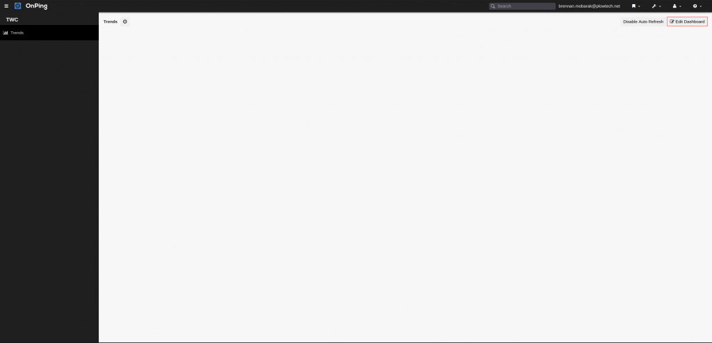
1) To begin, click on ” Edit Dashboard” in the top right.
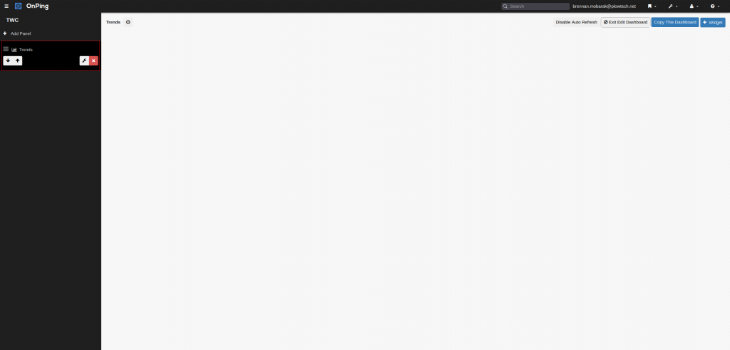
2) Next select the panel where you’d like to put a line graph.
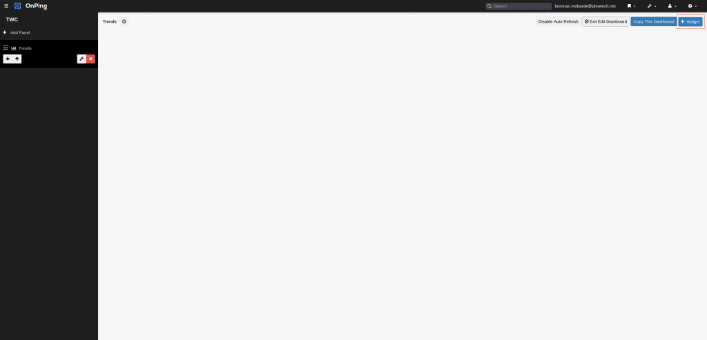
3) Select “+ Widget”.
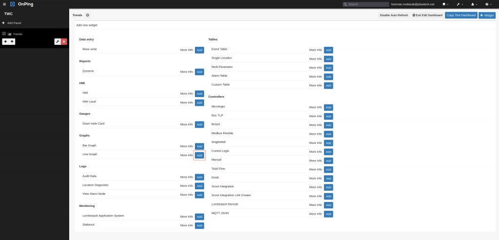
4) Click “Add” next to the line graph option.
5) Make changes that fit your needs for the widget name, graph title, “Update”, “Time Period”, and “Max Step”.
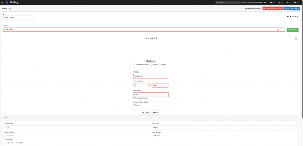
6) Change the “Axis Label”, “Plot Type”, and “Axis Side” for each axis. You can add another axis by clicking “+ Y Axis”.
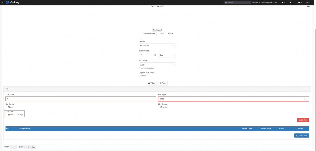
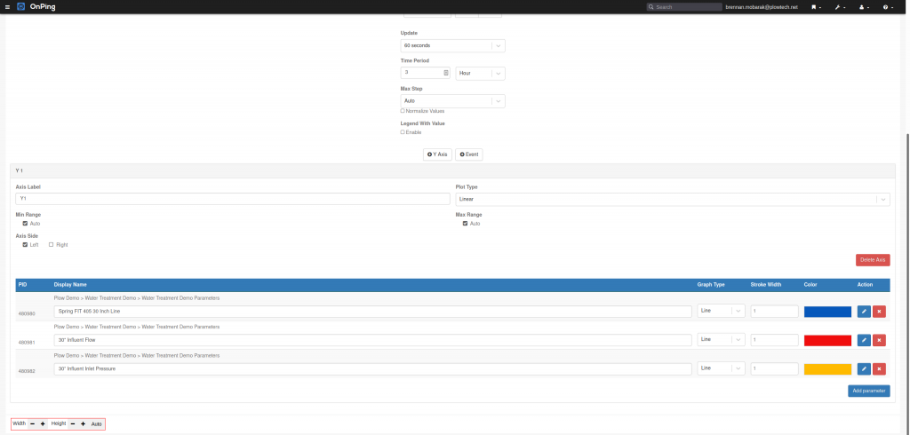
7) To add parameters to the graph, click “Add Parameter”. Then select the company, site, and location of the parameter(s). Select the parameter(s) needed and click “Confirm Selections”. After this is done, you can change the name that will appear in the legend, the graph type, the stroke width, and the line color. For a line with dots, select scatter. For a clean line, keep line selected.
8) The line graph widget box can be adjusted to fit more graphs on the screen. To do this, use the ‘+’ and the ‘-‘ buttons next to height and width in the bottom left corner of the widget.
9) Just as Data Analysis, the different parameters can be hidden from the graph. Do this by clicking on the name of the parameter(s) in the graph legend.
10) Click “Save Graph”, click the wrench to exit edit mode, click save in the top-right corner, and click exit edit dashboard to complete.
If you have any thoughts, ideas, or questions, please feel free to leave a comment below or use the contact feature at www.onping.net


